Reading time
13 min read
Date
Jan 2, 2026
Most AI sites look generic. Learn what design-first AI means, how to spot premium output, and how to choose a builder that looks custom.

AI can build you a website in minutes.
But can it build you a website you’d confidently send to the most important person in your network?
That’s the real question because the web is full of “fast” now. What’s still rare is taste: the quiet design intelligence that makes a site feel premium, intentional, and distinct.
This is where a new category is emerging: the design-first AI website builder. Not “AI that assembles a template.” Not “AI that fills placeholders.” But AI that behaves like a creative director, making the kinds of decisions that normally require design instincts.
If you’ve ever tried an AI website builder and thought, “This is impressive… but it looks like everyone else,” this guide is for you.
And if you care about brand perception whether you’re a solopreneur, freelancer, creator, small business, or micro-agency design-first AI is about to become the default expectation.
Curious what this looks like in practice? See the Allux approach to premium-by-default design.
What “design-first AI” actually means
A design-first AI website builder doesn’t start with sections.
It starts with taste.
In traditional website builders, you’re asked to make dozens of decisions:
Which layout block?
Which font pairing?
How much spacing?
What goes above the fold?
How do you keep everything consistent on mobile?
Design-first AI takes responsibility for those decisions because that’s where most websites either become premium… or become generic.
Design-first AI is defined by three things
1) It understands intent before layout
A photographer’s site should not feel like a SaaS landing page. A consultant’s site should not feel like a creator link hub. A restaurant’s site should not read like a portfolio.
Design-first AI adapts the story structure to the use case.
2) It produces premium hierarchy by default
Premium websites don’t “stack content.” They guide attention.
Design-first AI knows what should be emphasized, where the eye should land, and how to pace the page.
3) It maintains cohesion
The biggest giveaway of a template is inconsistency: mismatched spacing, uneven typography, sections that feel like they came from different themes.
Design-first AI keeps a single visual language across the page.
If “AI website builder” is the category, design-first AI is the premium tier: sites that feel authored, not assembled.
Why most AI websites still look generic
Most AI builders are trained to generate safe websites.
Safe websites:
use common section patterns
repeat the same structure across industries
rely on generic business copy
keep design choices conservative to avoid “mistakes”
Safety is understandable—but it leads to sameness.
That’s why many AI websites feel like:
“template + filler copy”
“startup landing page with new nouns”
“the same hero, the same features, the same testimonials”
And the moment a visitor senses sameness, trust drops. Not dramatically. Quietly. Subconsciously.
The hidden cost of “fine”
For certain categories, a generic site is an inconvenience.
For premium categories, it’s a conversion killer.
If you’re a creator, designer, coach, boutique service business, studio, or founder selling anything high-trust, your website is a credibility artifact. It’s not optional—it’s your first impression, your portfolio, your positioning, your confidence.
A site that looks generic doesn’t just look generic.
It makes your offer feel generic.
Design-first AI exists to remove that ceiling.
The premium design signals that build trust instantly
Premium isn’t more decoration.
Premium is restraint + clarity.
The difference between “nice” and “premium” is rarely loud. It’s in the quiet details most builders ignore—and the details users feel immediately.
Here are the signals that make a website feel expensive, modern, and credible.
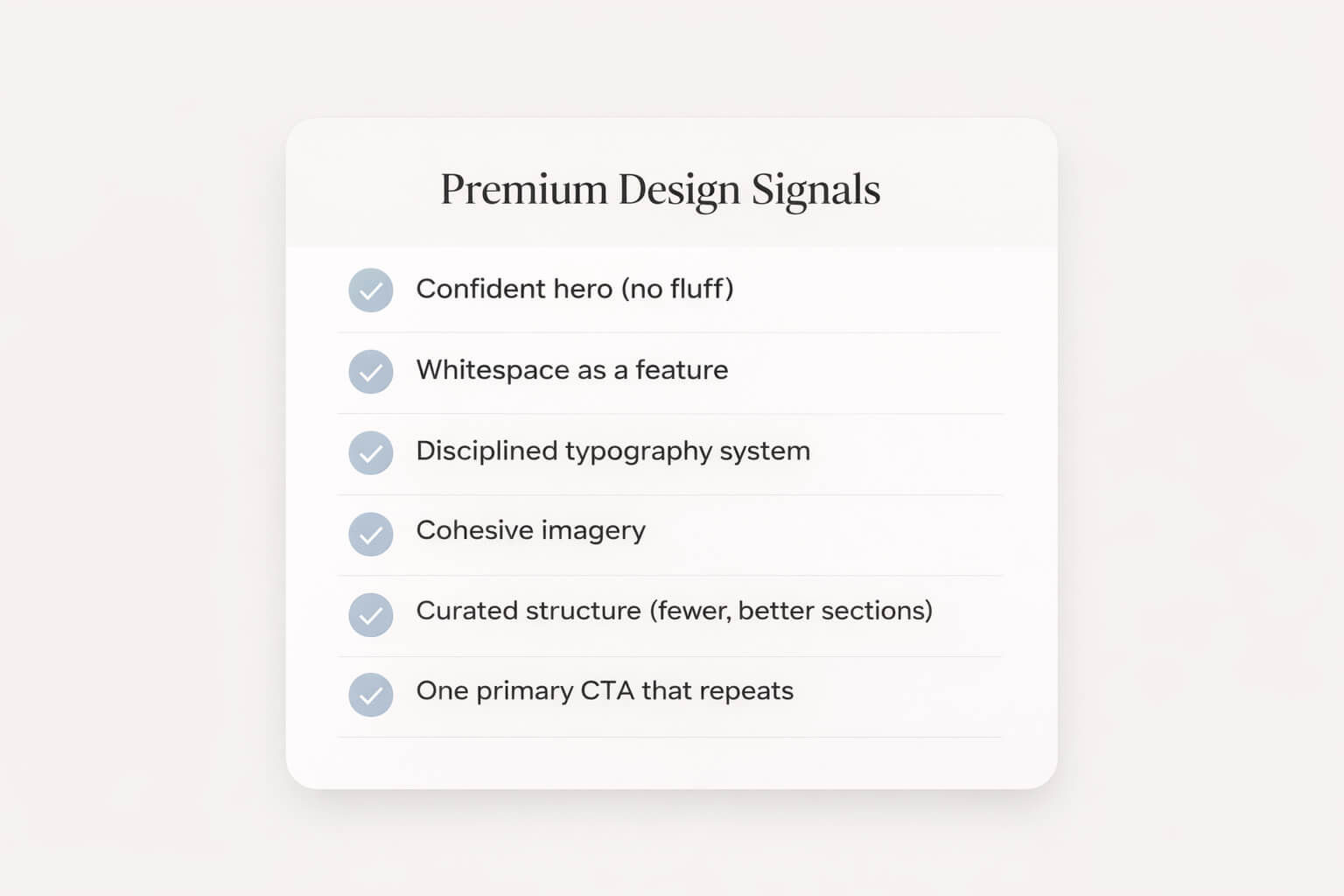
Signal A: A confident hero (no fluff)
A premium hero section doesn’t begin with “Welcome.”
It begins with a statement that orients the visitor immediately.
Great hero structure:
Headline: the outcome you provide
Subheadline: who it’s for + why it’s different
CTA: one clear next step
Example:
Headline: Premium websites, generated in minutes.
Subheadline: Design-first AI for founders and creators who refuse generic templates.
CTA: Create your site.
Signal B: Whitespace that feels intentional
Whitespace isn’t emptiness—it’s confidence.
It creates calm. It frames what matters. It makes typography and images feel valuable.
Most generic sites feel cramped. Premium sites breathe.
Signal C: Typography discipline
Premium websites don’t show off fonts.
They use fewer fonts, better sizes, consistent spacing, and clear hierarchy.
Typography is where “template energy” usually leaks out:
too many weights
inconsistent sizes
line height that feels default
headings that look like placeholders
Design-first AI should handle this automatically.
Signal D: A cohesive visual language
Premium websites feel like one world.
Not a collage.
That means:
consistent image treatment (tone, warmth, contrast, crop)
consistent corner radius and UI style
consistent spacing rhythm across sections
consistent CTA styling (one “voice”)
Signal E: Curated structure (less, better)
Premium brands don’t add sections to feel complete.
They remove sections to feel confident.
“More” often reads like uncertainty.
Premium reads like curation.
Signal F: A clear conversion path
A beautiful website that doesn’t guide action is a mood board.
Premium sites still convert—quietly, elegantly:
one primary CTA
repeated at natural decision points
supported by proof (logos, testimonials, outcomes)
The best design-first AI outputs should feel like a brand and behave like a landing page.
How design-first AI should generate a website
The ideal design-first workflow looks like this:
Step 1: Clarify the site’s intent
The AI should begin by understanding what kind of site you need:
portfolio
services / lead gen
product / SaaS
local business
creator brand
agency / studio
Because the structure changes with intent.
Step 2: Choose an aesthetic direction
Not just colors—an atmosphere:
minimal editorial
modern luxury
bold and high contrast
calm and airy
playful but refined
A design-first builder should feel like it’s selecting a design language, not selecting a layout.
Step 3: Generate a cohesive first draft
A real first draft should already feel publishable:
strong hierarchy
consistent typography
thoughtful spacing
intentional section flow
copy that doesn’t scream “placeholder”
Step 4: Let you refine without breaking it
You should be able to:
adjust sections
swap imagery
edit copy
tweak style
without accidentally turning the design into a patchwork.
This is one of the hardest parts to get right: giving flexibility while preserving taste.
Step 5: Keep it premium on mobile
A premium website that collapses into chaos on mobile is not premium.
Design-first AI needs a mobile-first mindset:
readable type sizes
calm spacing
clean nav
CTA visible early
images cropped intentionally
If AI can generate fast, it can generate beautifully—if the system is built around design decisions, not just completion.
The checklist: how to choose the right design-first AI builder
If you’re evaluating tools, use this list. It’s practical and brutally honest.
Output quality
Does the first draft look like something you’d publish?
Or does it look like “a generated starter site”?
Uniqueness
Do different prompts lead to genuinely different aesthetics?
Or does everything converge to the same “AI template look”?
Cohesion
Does the site feel like one design system?
Or does it feel like stacked components?
Editing experience
Can you refine quickly?
Can you keep it minimal without fighting the tool?
Does the editor feel modern and calm?
Brand control
Can you align typography and spacing?
Can you maintain a premium visual rhythm?
Can you express your tone without rewriting everything?
Growth readiness
Will the site still work when you expand pages, add sections, or evolve the brand?
Or will you outgrow the structure fast?
A builder can be “good” and still be wrong for you.
The right tool depends on whether design is central to your credibility.
If it is, you want design-first.
Explore a design-first AI approach built for premium outcomes: Learn more
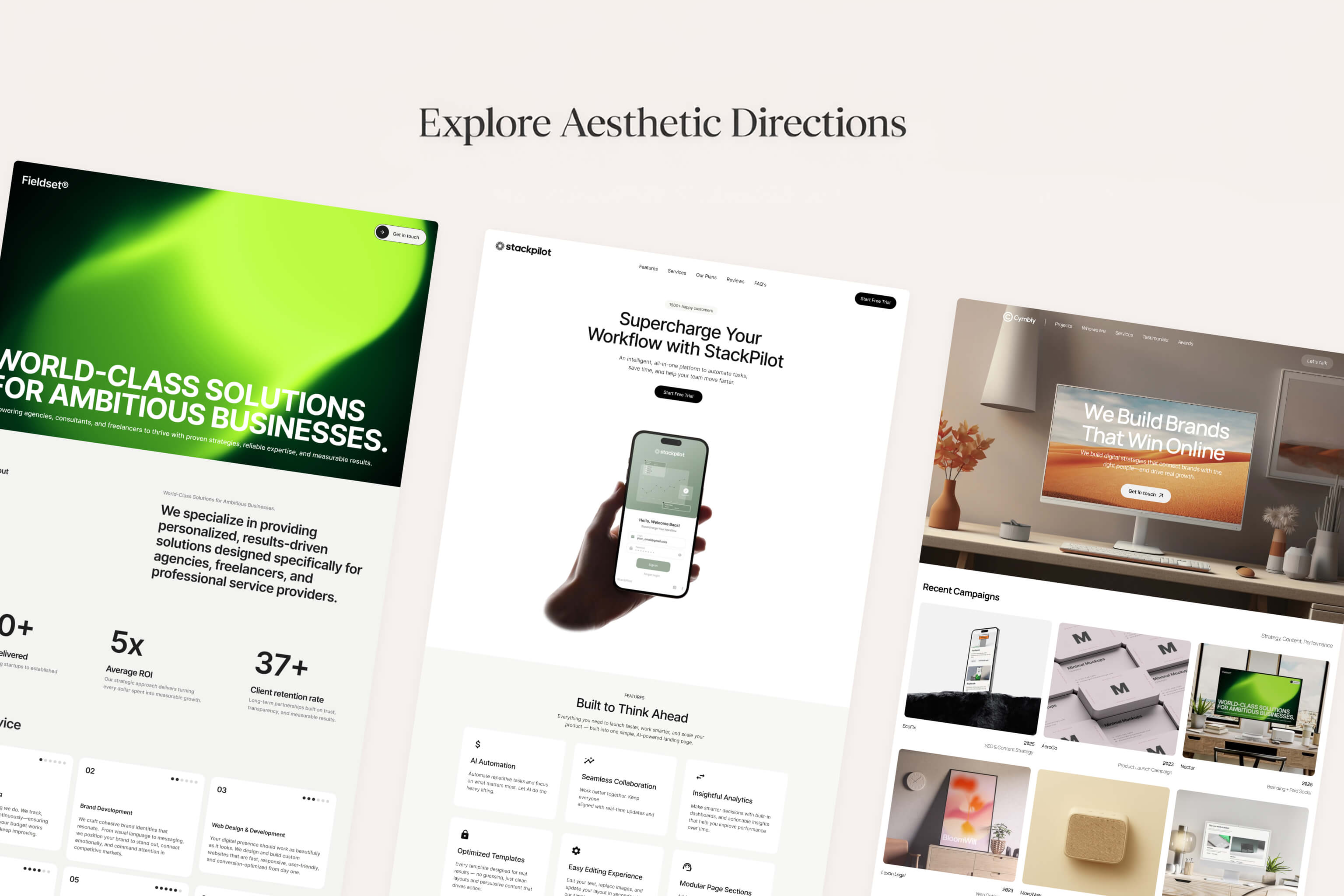
“Templates that don’t look like templates”: what it really requires
A lot of products claim “unique templates.”
But “unique templates” often means:
the same structure with different colors
the same hero with different images
the same page, different nouns
“Templates that don’t look like templates” requires something deeper:
A) Structural variety
A premium generator needs multiple story architectures:
editorial layout styles
bold minimal landing styles
gallery-forward portfolio styles
conversion-focused service styles
Not one layout with many skins.
B) Typography and spacing as core output
Most tools treat typography as a theme setting.
Design-first systems treat typography and spacing as the design.
C) Copy that reads like a brand voice
Generic copy is the fastest way to make a website feel templated.
Design-first AI should produce:
short lines
specific claims
modern tone
clean CTAs
fewer clichés
D) Intent-aware section selection
A creator site doesn’t need “Features.”
A local service site doesn’t need “Roadmap.”
A premium studio site doesn’t need 12 sections.
Section choices reveal whether the generator understands real-world websites—or just builds the same thing repeatedly.
“Templates that don’t look like templates” is not a design library problem.
It’s a system design problem.
How to brief AI like a creative director (prompts that work)
Even a premium generator needs a good brief.
The goal is to describe:
who you are
who it’s for
what outcome you deliver
how it should feel
The best one-sentence prompt template
I help [audience] achieve [outcome]. Style: [aesthetic]. Feeling: [emotion].
Examples:
“I help founders launch premium brands. Style: minimal editorial. Feeling: calm confidence.”
“I shoot cinematic wedding photography. Style: modern luxury. Feeling: warm, timeless.”
“I coach busy professionals on strength and consistency. Style: sleek modern. Feeling: disciplined energy.”
Add a “don’t” clause (this is powerful)
If you want premium output, tell AI what to avoid:
“Don’t use generic startup copy.”
“Don’t add too many sections.”
“Don’t make it playful—keep it refined.”
“Don’t use cliché marketing phrases.”
A strong brief isn’t just what you want.
It’s what you refuse.
A quick premium copy swipe file (you can reuse)
Here are premium-style lines you can use as inspiration:
“Built to feel inevitable.”
“Minimal. Modern. Ready to launch.”
“A premium site in minutes—without the template look.”
“Design-first AI for brands that care.”
“Beautiful by default. Flexible when you need it.”
Short, specific, confident beats long and vague every time.
FAQs
What is a design-first AI website builder?
A design-first AI website builder prioritizes design quality—hierarchy, spacing, typography, cohesion, and intent-based structure—so the first draft looks premium, not generic.
Is design-first AI just a fancy template?
No. Templates repeat. Design-first systems generate a cohesive design direction and structure based on your intent and aesthetic—then keep it consistent as you edit.
Do premium websites need animations?
Not necessarily. Premium is primarily typography, spacing, imagery, and clarity. Motion can enhance the feel, but it’s not required.
Will a design-first AI builder help conversion?
Yes—when the design improves clarity and trust. Premium design often increases conversion because visitors feel more confident engaging.
How do I make an AI-generated site look custom?
Start with a strong brief, use consistent imagery, tighten the hero copy, keep sections curated, and maintain a disciplined type and spacing system.
Summary: the new standard is speed and taste
The AI website builder category has matured past the “wow, it generated a site” moment.
Now the real question is: does it look like a brand?
Design-first AI is the answer—because for modern founders and creators, the website isn’t a checkbox. It’s a credibility artifact.
If you want a site that feels premium without spending weeks in the builder, start with a design-first approach.
Next step: Explore Allux AI